A design system created with adaptation in mind
When I was working on Scandinavian Photo's design system, a lot was going on in our department. We were launching a new store concept, rebranding, and undergoing a large reorg. So, I had to make sure our design system could handle both our current situation and also easily adjust to upcoming initiatives and changes.
- 📎
- Role: UX Designer & Design System Owner
- Time frame: 4 months 2024
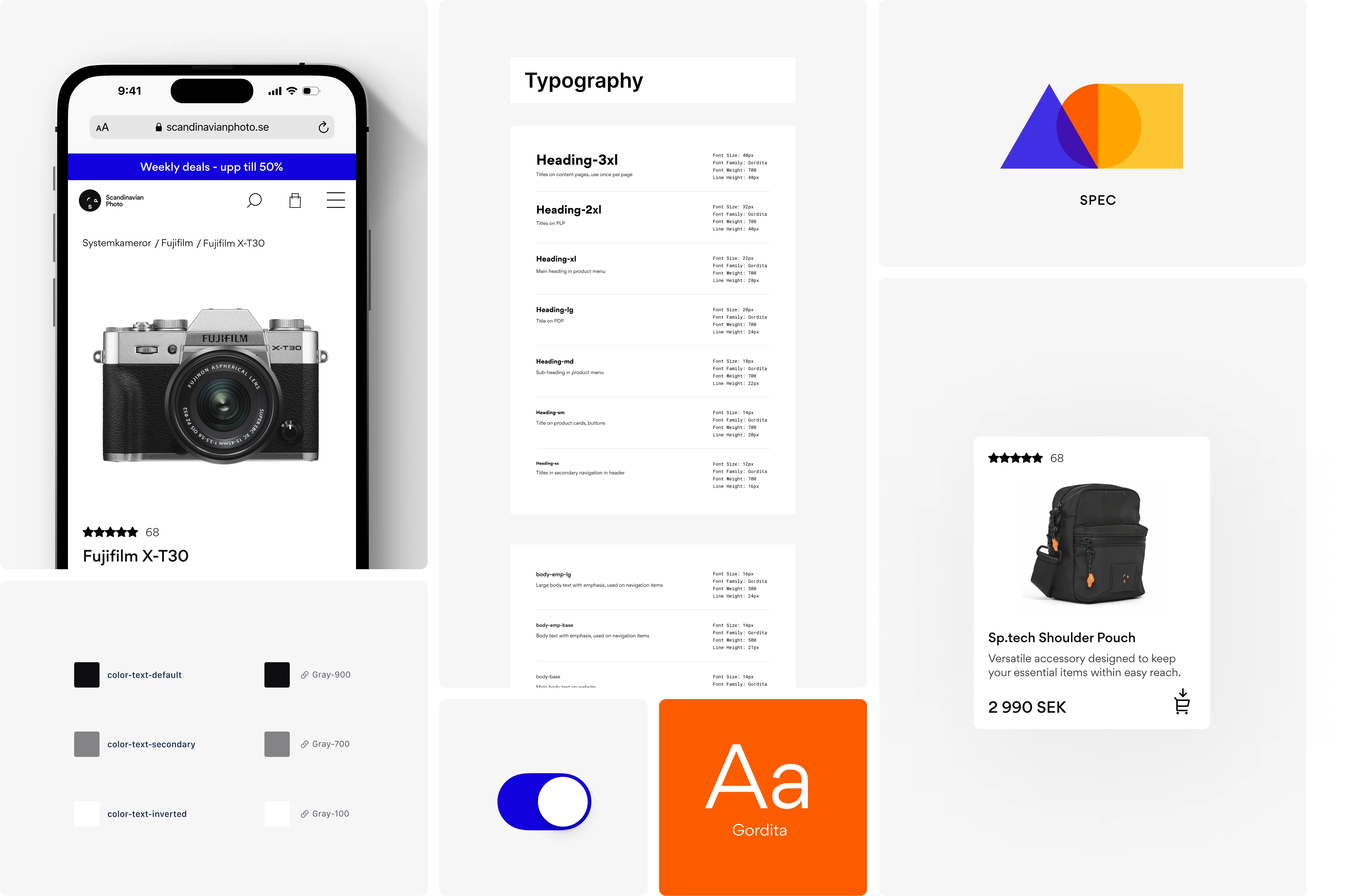
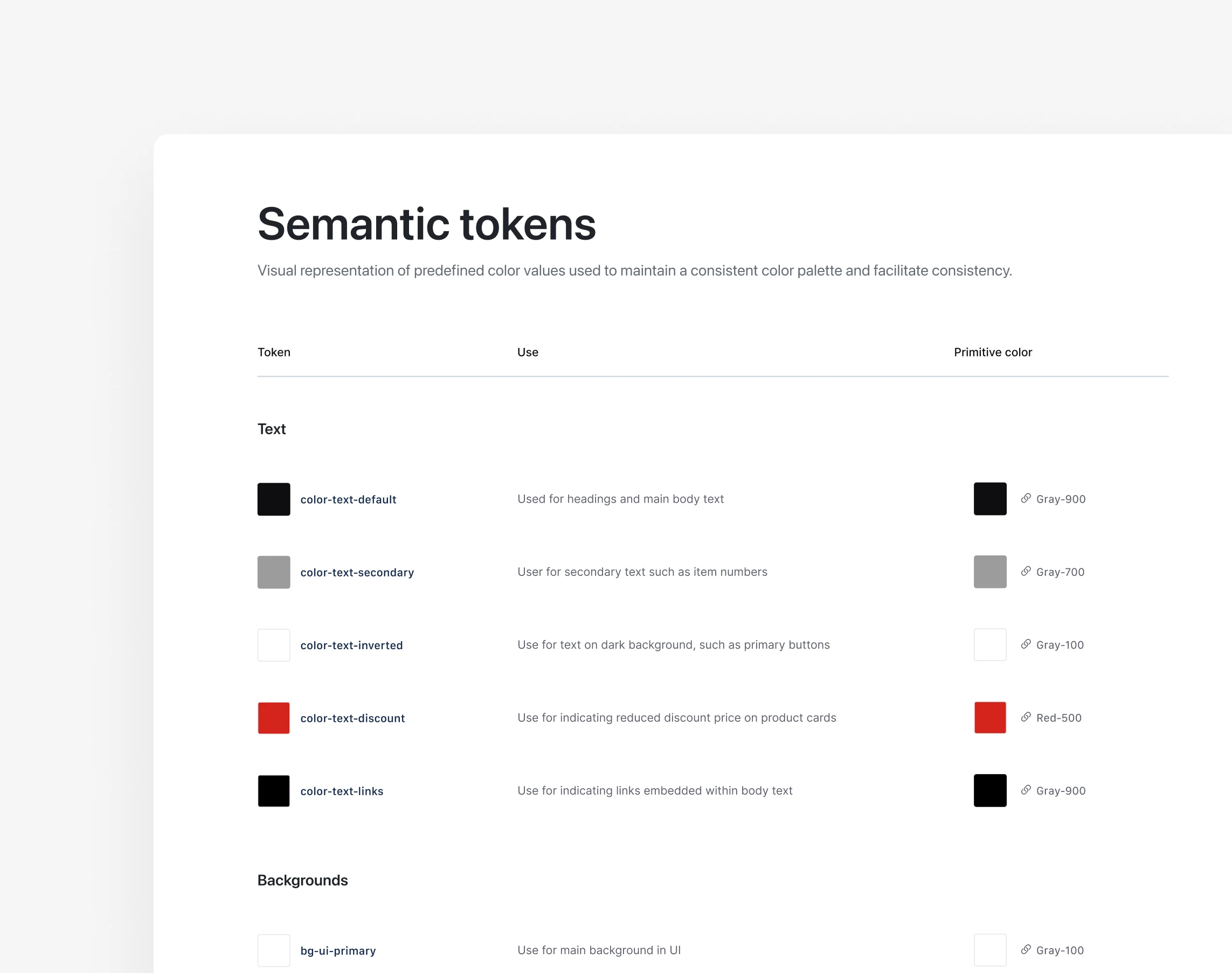
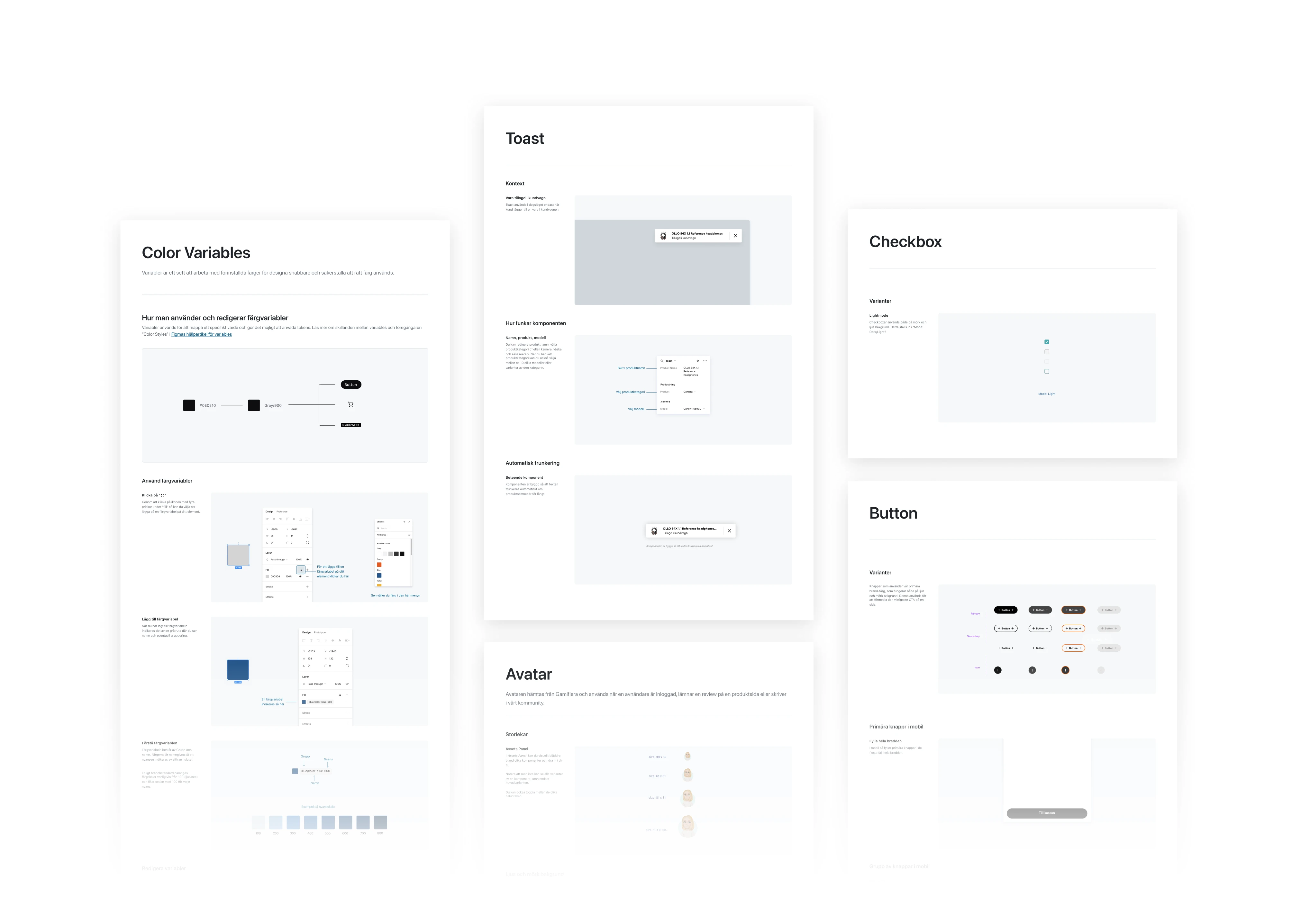
- Result: 70+ components, 60+ styles/variables, guidelines and onboarding